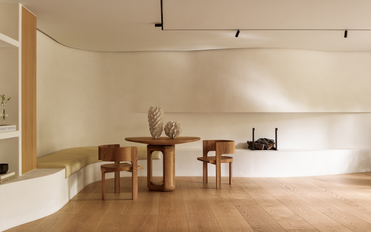
Comfort and glamour: the two defining elements of any Natalia Miyar project. The London-based design atelier is hot on spatial planning (not surprising when you learn that Miyar is a qualified architect as well as an industry-leading interior designer) and texture and colour infusions which weaves liveability and personality through every one of its projects.

Step Inside This Art-Inspired London Apartment
Art at its best—in a stylish interior—courtesy of the LuxDeco 100 designer

In summarising the designer in this year’s LuxDeco 100, I wrote: “Daring with texture and/or colour (or both) is the lynchpin of London-based designer Natalia Miyar’s work—a signature trait borne of her eternal design inspirations.”
Introductions over, the designer’s work is really best seen to be understood where proof of Miyar’s touch is evident. We explore the designer’s softened take on contemporary for a recent to-die-for Belgravia home renovation.
AN ARTY COMMISSION
Modern urban—two of the first words in the brief to Natalia and her team from this art-collecting client. But, before the decor, came the architectural challenge of turning this 19th-century Belgravia building’s two separate apartments into one luxuriously spacious pad. Cue the roof extension that doubled the residence’s footprint and flooded it with natural light.
Next, the palette which was in large part dictated by the need to showcase a remarkable art collection. The Belgravia client desired a masculine, clean and neutral character for his soon-to-be-transformed city dwelling. Though a diversion from Natalia’s natural propensity for colour, her architectural training, personal understanding of art’s importance in an interior and never overdone style is what surely led him to the London interior designer’s doors.
The result is an unusually colour-free but just as recognisable Natalia Miyar space which blends the coolness of contemporary character with the easygoing warmth for which she's recognised. In every room, crisp, modern architecture meets mink-hued accents, grey stone or timber flooring, neutral linen wall coverings, and a tonal palette of zen blues, ochre and rust.
BESPOKE CASUAL LIVING
Head first to the hallway where Natalia made her intentions known with white walls painted in Farrow & Ball’s Pointing—a warm white which was used throughout the property—teamed with woody tones underfoot. Nothing could provide a more understated yet welcoming starting point, perfect for the home’s first display of striking modern art, Le Profil qui Disparait by Alexander Calder. And is there a more powerful presentation of contemporary, masculine design than the bronze balustrade—in an elevation of the architectural—that complements, cooly, the marble console table by Archi Mobilier?
Into the first of two sitting areas, where this first, more formal living room leads out onto a terrace, lending the room an ever more airy atmosphere. The Atelier selected low-lined seating, from bespoke ivory sofas to vintage leather strap armchairs—all expertly combined for maximum textural contrast. Never destined to be a blank white box (at least not on Natalia’s watch), the scheme acts as a background for the earthy toned artwork which is at once unobtrusive but interesting.
The smaller, secondary living room is more of a snug scenario with a modular sofa in a fabric that’s rich in visual texture and christened ‘Desert Snow’, softened by the accompanying petrol blue velvet ottoman and surprise Roman blind in the delicate Tic Tac fabric by Dedar.
A PLACE OF REST
A place to cook, dine and entertain is strategically planted between the sitting rooms with aspects like the bespoke dining table’s metallic pedestal base linking back to the bronze hallway staircase, aesthetically connecting the rooms. It is in the kitchen however that the use of gleaming metal bursts onto the scene in a new guise—copper. The oversized copper cooker hood serves to not only break up the use of blonde wood cabinetry and white marble, but it ties into the threads of burnt orange and rust already sewed in the earlier reception rooms.
And so to bed. Bedrooms, that is—all of which are located on the home’s lower floor. The master suite is the softest of them all with textiles touching almost every surface, from the linen wall coverings by Stero and the Pierre Frey covered headboard to the fabric lampshades by Zimmer & Rohde and decadent bedroom armchairs upholstered in yet another Pierre Frey fabric, this time an alpaca, merino, mohair blend. Its palatial ensuite bathroom is made so thanks to the Bianco Lasa marble river that sculpts itself into cantilever sinks, a cavernous enclosed shower and a freestanding bath tub as its principal features.
The remaining two bedrooms and guest bathroom are by no means left out in terms of luxury, with further attention to detail evidenced by the continued use of textile wall coverings, textured wallpapers and yet more examples of the atelier’s most exquisite, no-expense-spared bespoke furniture.
Subtle and not so subtle pattern mixing, vibrant upholstery in the form of an eye-catching orange velvet bench and sculptural lighting characterise one; the other offers a muted, sophisticated colour palette of moss green, taupe and slate grey, twisted crystal table lamps by Tyson and Greek fret-lined cushions. Despite their distinct looks, as a pair, the two are reminiscent of that dichotomy of comfort and glamour, both quintessentially Natalia Miyar, and their happy coexistence.
Header Image: Natalia Miyar


