LuxDeco

A compendium for luxury living
9 Minimalist Hallway Ideas | Hallway Design | LuxDeco.com

9 Chic Minimalist Hallway Ideas

These palette cleansers are the epitome of modern design

Linda Holmes
By Linda Holmes, Interiors Director

Minimalist design has a unique appeal. It’s characterised by a pared back aesthetic in which bare expanses of usually colourless walls set the stage (art galleries are often quintessential minimalist spaces), sparse styling reigns and overdecorating is practically sinful.

Minimalist design is inherently pure and simple, and yet, in spite of what might be perceived as a basic approach, designers with minimalist tendencies are, in a very real sense, spatial architects, creating something out of very little. Their understanding of space and form is paramount. Some might argue that, in fact, each line, each furniture piece, each considered blank space is even more integral to the overall look of a minimalist space than any other style.
Shop Minimalist Furniture & Decor Online at LuxDeco.com

Maybe it’s the satisfyingly clean palette; maybe it’s the calming use of line and symmetry (minimalism is brilliantly restful); or maybe it’s the fascination that even one displaced, additional or removed item would result in something much less pleasing. Whatever the reason, minimalism works and it’s, uniquely, eternal, existing instead in a time-transcendent realm.

Experiment with these minimalist hallway ideas – taking style notes from leading designers – for the perfect start to your spring clean.

9 Minimalist Hallway Ideas | Minimalist Hallway Design | LuxDeco.com

1. Spatial Awareness

Above, an airy entryway by Finchatton masters the essential component of minimalist design – nothing is present that could be removed without effect. Located in a contemporary home in London’s prestigious Chelsea neighbourhood, the hallway makes a feature of the soft natural glow which diffuses through its double-height translucent windows by keeping its palette and lines clean and crisp.

An Oriental-inspired hallway console table, which rests under an oversized mirror, is simply styled with matching cage-like column lamps and a trio of modern glass vases; a gestural canvas – which incorporates vibrant splashes of red – dominates the facing wall. Its polished marble floor – realised in an immortal monochrome palette – is accented with a bronze inlay finish to mirror the framework of the windows.

2. In The Mood

Moving towards a more dramatic take on minimalism (an equally successful approach), New York-based Yabu Pushelberg masters the concept within a concept idea in this Hong Kong hallway.

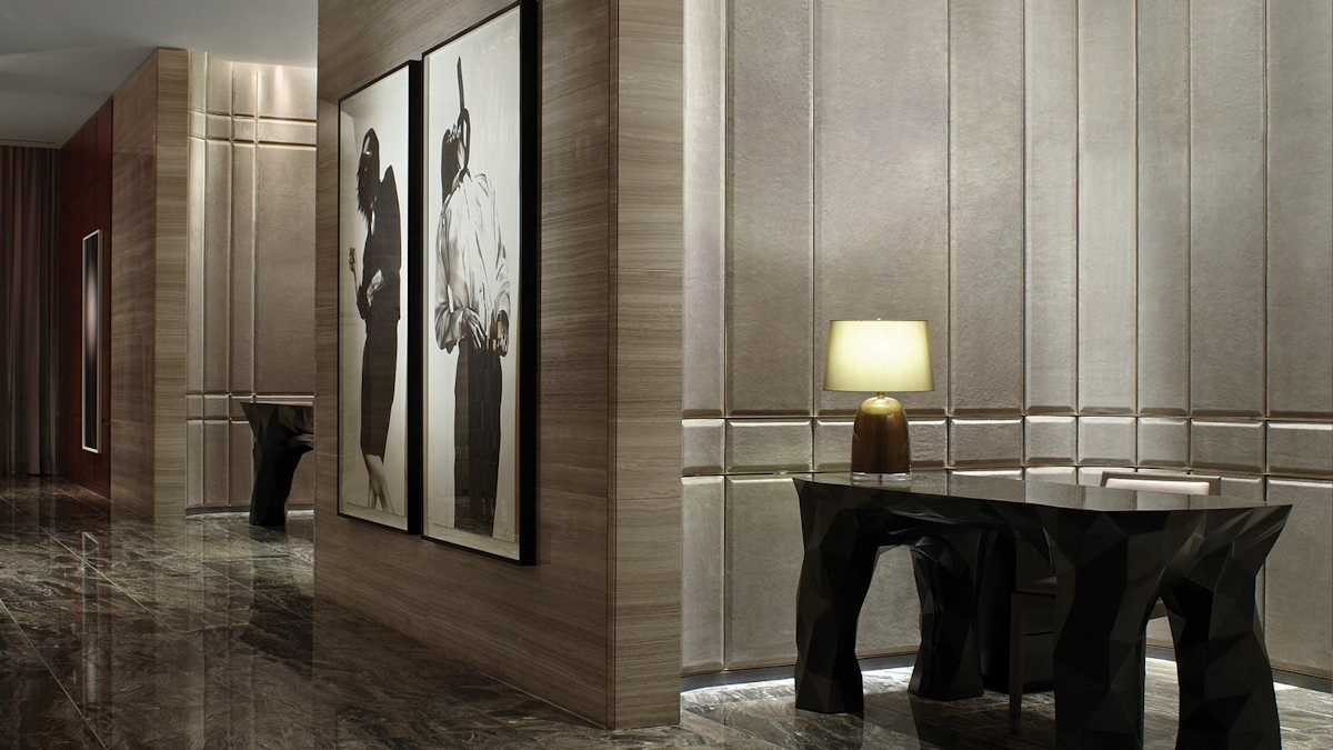
At its heart is a captivating photographic print – an artistic representation of minimalism’s ideals. The piece takes centre stage in the space which, itself, showcases a lot of the same elements. Although not abstract or modern in theme, its style offers many of the style’s distinguishing elements – a penchant for light play, a focus on architecture and a notable lack of adornment. Its chiaroscuro-like shading draws the eye to a console table constructed of interlinked and geometric wire shapes, topped with simple brass sculptures and hurricanes. Tilted panels which let shafts of light streak across the display and grey wood walls add mystery.

3. Playful Fancy

Parisian designer Stephanie Coutas experiments with the style in a playful way in this hallway. Black marble stripes dash across the flooring, an irregular brass hallway mirror recalls melting Daliesque forms and a glowing art installation reinterprets the “light at the end of the tunnel” phenomenon in a chic way.

As the space’s only hallway furniture piece, a particularly minimalist console table underpins the overall design. Subtly textural wooden posts, painted in black, are topped with brass plates with a slim-lined white marble top connecting the two and beautiful hallway decor. Simple yet refined, it’s what minimalist dreams are made of.

The space’s Art Deco-inspired ceiling decor confirms that the style can handle some decoration so long as it adheres to its core principles.

Its ceiling’s careful network of stepped squares and arc outlines adds interest to the often forgotten fourth wall; its white palette maintaining the integrity of the style.

4. Asymmetrical Beauty

Just as much as symmetry is a prominent feature in minimalism, the use of careful asymmetry is equally effective as MR Architecture + Decor proves.

Retaining its minimalism with a jet black and pure white colour palette, this hallway features an asymmetrical console table which is offset by a collection of scattered rustic pottery. The sharpness of the console’s staggered legs and simple glass top contrasts the pottery’s varying textures and finishes creating an exciting tension. (This combination also prevents minimalist design from feeling too clinical.) Although an unlikely pairing, the two enhance the beauty of each other without apparent effort – an important tenet of minimalism.

The display is topped with an atmospheric canvas – its wispy, dawn-breaking horizon creating a sense of hopeful enlightenment.

5. Architectural Wonder

Modern designer Deborah Oppenheimer is a champion of minimalism, explaining that “minimalist design should never feel cold and soulless.” She executes minimalist perfection in this expansive stairwell via installation lighting, an understanding of positive and negative space and a correct proportions.

Overhead, the oversized metal light sculpture is the perfect match for the the wide, sweeping curve of the staircase; on the ground level, proportions are slightly smaller, although collectively so. All the elements of the main furniture arrangement are given space to breathe – a fundamental characteristic of minimalist design.

“I find the key is the tension between open space and well-proportioned pieces which are well-detailed and elegant."

"Light plays an important role. I always try to capture a quality of luminosity and calm so everything looks understated and quiet. I am particularly fond of large pieces of furniture to help form an interior always remembering that beauty is about perfect editing.”

6. Classical Interpretation

France may be a country known for its ornate Louis, Baroque and Rococo furniture but its capital is a town renowned for the less-is-more mindset with designers striping back from time to time, however classically trained they are. Whilst Jean-Louis Deniot is well-trained in neoclassical design fit for a French palace, for this hallway he trades opulence with restraint, interpreting classicism in a minimalist way.

Far from stark, the design mimics the same sense of welcome as a busier space thanks to its uplifting, near celestial vibe and subtle verve. Vaulted cornicing in a contemporary design as well as rich marble flooring which serve as the space’s foundation combine the old and new world, creating a type of historically informed minimalism.

The notably classical technique of symmetry is seen in the mirror image hallway bench and sculpture vignette on either side of its white opaque doors, which help to retain a sense of composure. The hallway’s whimsical metal sculpture is the epitome of minimalism; its placement at the end of the hallway is particularly classical, however.

7. Island Simplicity

Finchatton’s Orchid apartment – set in the tropics of the Bahamas – is a prime candidate for care-free, minimalist living. Such hot climates, sandy environs and sunny days demand simplicity (not to mention easy upkeep situations) borne of a nonchalant approach to design.

In its marble-clad hallway, a neat open-fronted cabinet is carefully accessorised with smooth, sculptural vases and a trio of white selenite crystals. Symmetry is established in the black and white marble flooring and the matching pendulum-hung table lamps which are drawn together by an abstract modern hallway artwork. Ceiling cove hallway lighting elevates the space and creates illumination in the window-free area. The whole look is then reflected by a wall of facet-like bevelled mirror panels, expanding the space simply but effectively.

8. Marble Love

For his own Paris home, Jean-Louis took the minimalist marble theme and ran with it. Entirely clad in a marble-effect tiling and marble flooring, the hallway’s bones are the epitome of minimalism – the all-marble blank canvas standing as a luxe version of an all-white blank canvas.

There’s a unique interplay between the elements of the space which are all connected in some tenuous way. Whilst not as refined as the marble, the pedestal mirrors its colour palette; the sculpture has the same frame-like silhouette as the pedestal; the gold-framed oil portrait holds the same dignity as the sculpture; the designer’s klismos-style Hera bench (for Pouenat) shows a sense of innovation of the old, like that of the placement of the portrait on the back of a concealed door.

Each item is connected to the next. Such luxurious additions (although seemingly ironic for a style which values spareness) challenge the aesthetics of minimalism. Here, the designer finds a way to incorporate old with new without compromising minimalist values.

9. Stone Age

Taylor Howes is no stranger to quality materials but this harmonious hallway design focuses on the singular beauty of its hero material in a big way.

Large-scale stone slabs in an inviting oyster hue clad the walls in an understated but confident way which references Mies van der Rohe’s Barcelona Pavilion. Its outdoor/indoor feel channels the tranquility of natural materials in a refined way.

Outlined by a black gloss finish, a clean-lined console table sits in front of the wall, introducing a simple architectural dimension. Its tonal drawer fronts replicate the texture of the stone and its modest form doesn’t detract from the space’s main feature. The understatement continues with an oversized but barely-there sculpture of eccentric circles and the minimalist’s flower of choice – the orchid – which softens the look.

;