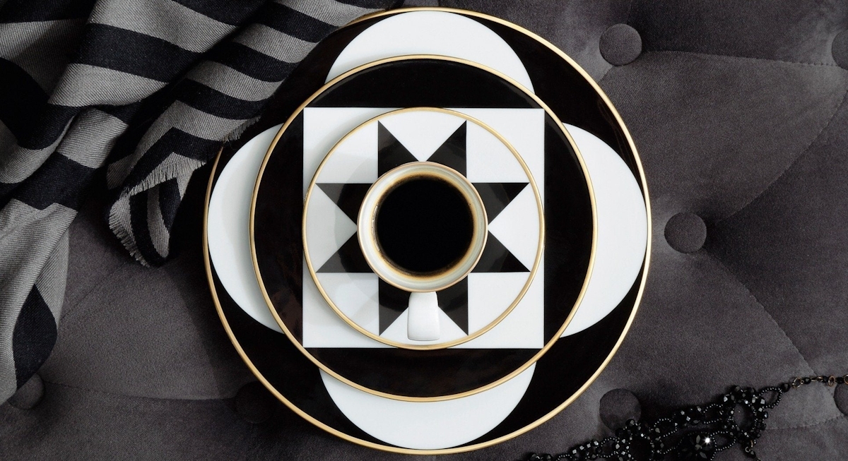
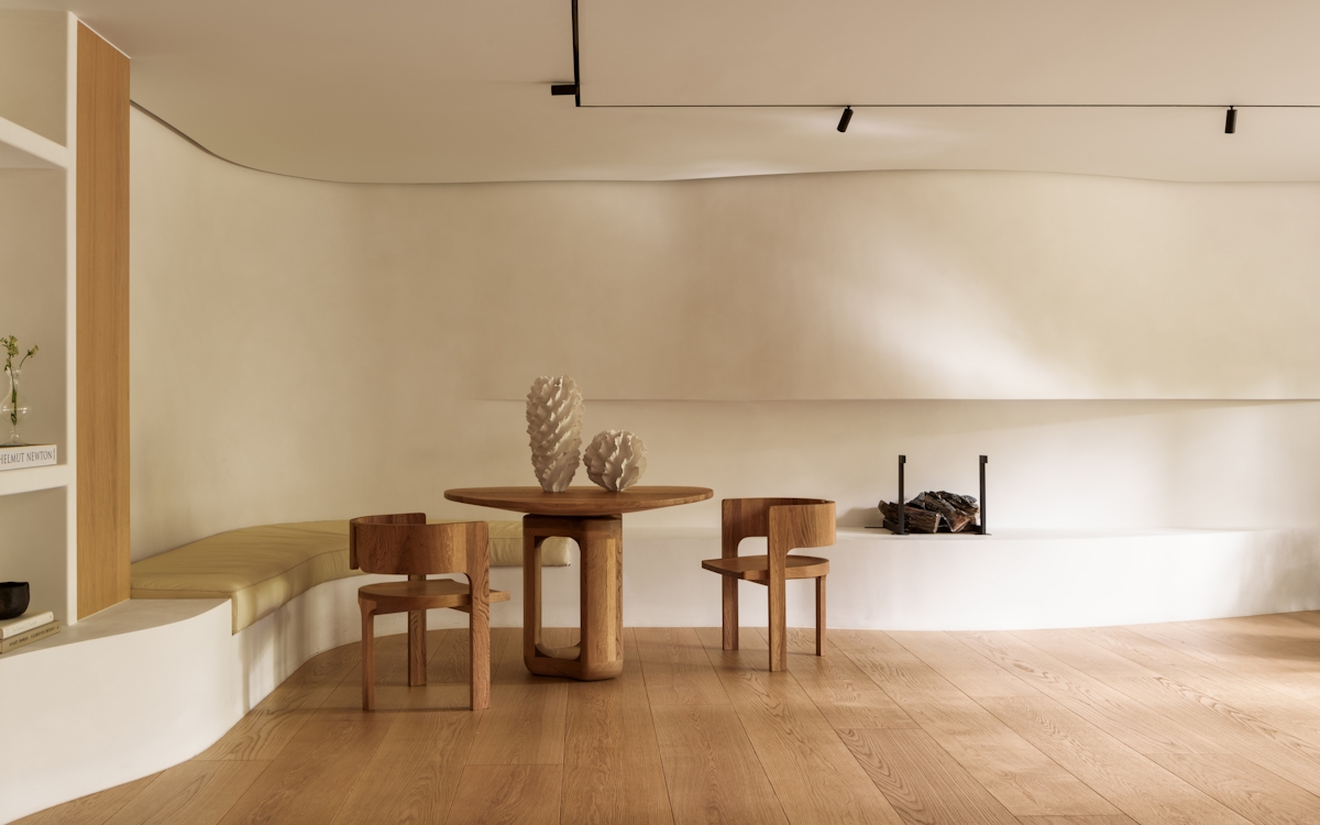
Almost all types of geometric pattern when used en masse are typically linked to three styles of aesthetic – Art Deco, Mid-Century and Contemporary. Here, you can afford to style a room with multiple sorts of shape and pattern, but it’s still important to not go overboard or no one shape gets its moment in the spotlight.
Too many references to geometric design means each pop gets watered down and there’s little cohesion.
Either stick to one category of shape and repeat throughout the room – this is one way of how to make a geometric pattern in a statement-worthy way, such as in the line-focussed Greg Natale bedroom where wallpaper, throw and pillows share the same point of view.
Similarly, the Martyn Lawrence bathroom lets the square take centre stage by using it from head to toe in tile work. Or pick three and spread them to cover geometric furniture and geometric home accessories in whatever volume works for you.
The Interior Marketing Group’s living room mixes line, square and triangle in its artwork alone and yet the overall effect is subtle.


