As with domestic projects, high up on the subject list for restaurant decor ideas is that of the colour scheme.
“It’s quite common for restaurants to be bold with their colour choices. In a sitting room or dining room there are just a few items of furniture and the colours chosen feel very much ‘on show’, in a restaurant setting, the volumes of furniture, accessories and light sources are far greater so there’s a distraction from the colour. It’s this that encourages the bravery and exploration in colour,” says Linda.
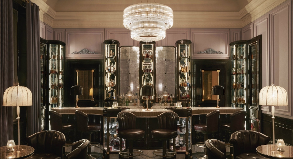
Colour in a restaurant can also become a huge talking point. In larger establishments, it acts as a tool to define distinct areas. David Collins Studio used colour as a trademark in numerous high-end projects, such as the Blue Bar at The Berkeley or the heather cashmere walls in The American Bar at Gleneagles. The colour becomes an icon for the restaurant in question.
Remember, also, with colour decisions to reflect on how they sit together in daylight and how they evolve when night falls and they rely on candle and lamp light for luminosity.


