Chicago’s luxurious new hotel couldn’t be any more replete with style precedence. The most recent branch of the Langham group has only gone and bagged itself one of the Windy City’s most sought-after spots – Mid-Century master Mies van der Rohe’s IBM Building. Now known as the AMA Building, the skyscraper – which stands at 330 N. Wabash in the heart of downtown Chicago – was Mies’ last office block in the US, his tallest at 52 stories and was declared a Chicago Landmark in 2008. In fact, the German-born architect didn’t see its 1971 completion having passed away in 1969.

Mid-Century Glamour
The newest addition to the prestigious Langham dynasty lands in Chicago’s iconic IBM Building

A one-time office block by a Bauhausian architect might not have seemed the most obvious choice for such a luxurious hotel – the original Langham in London was considered Europe’s first ‘Grand Hotel’ when it opened back in 1865 and the group has continued in the same vein. But one look at the finished project and any doubters have well and truly had their concerns put to bed. Its cocktail of appropriate Mid-Century modern touches and original features combined with a subtly glamorous sensibility and unbeatable colour palette grounded in refreshing neutrals makes it the perfect hybrid of its dual history. Of course, nothing less could have been expected from a project which is the collaborative effort of three of the design world’s most illustrious names including a member of the Mies lineage.
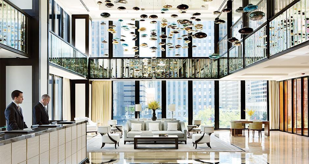
Dirk Lohan – of Lohan Anderson who was commissioned to design the hotel’s front lobby – is the grandson of Mies and worked with him on the building early in his career. This poetic return to a much-loved project has resulted in one of the hotel’s most special spaces. The front lobby – travertine-clad and floored in marble, both original features – retains a spirit for which Mies was so renowned. “My sincere hope is that the lobby is embraced as a refined solution for transforming an office building lobby into a hotel lobby without disrupting the essence of a Mies van der Rohe building,” the designer relates.
The concern behind that hope seems completely unwarranted however. Brilliantly architectonic with a penchant for openness and a focus on high quality materials, the area is the perfect contemporary incarnation of Mies’ style and sets the tone for the rest of the hotel. Its custom-designed front desk harks back to Mies’ Farnsworth House and its sofas are never-before-seen or commercially produced Mies pieces, originally designed for his daughter Waltraud.
Ascend from the lobby to the next floor (the hotel occupies the first 13 floors of the tower) and you find yourself with the choice of the main reception area and its adjoining Pavilion Lounge, designed by hospitality interior design firm Richmond International – also responsible for the hotel’s London chapter. Both spaces are equally as spacious and airy as the lobby downstairs thanks to their 22-foot-high floor-to-ceiling windows – a design choice made to “bring the landscape of the city further into the building”. Fiona Thompson, principal interior designer at Richmond, explains, “The Pavilion is decorated with a cream palette with burnt orange accents that are reminiscent of the vibrant red shade found in the onyx in Mies van der Rohe’s Barcelona Pavilion.” A captivating canopy of 500 glass-blown pebbles by Czechoslovakian brand Lasvit references the pebble pond of the eponymous work whilst a variety of self-contained seating and dining arrangements offer intimate spots to relax and enjoy the hotel’s tradition of afternoon tea, Tiffin at The Langham.
When you’re not snacking on refined finger food in the Pavilion, dine on contemporary Mediterranean fare by Chef Tim Graham at the hotel’s Travelle restaurant. The eatery was designed by Academy Awards set designer David Rockwell and is undoubtedly the hotel’s most Mid-Century modern environment being inspired by the movement as well as the original occupant, IBM. Here the style’s instantly recognisable furniture really comes into its own. Simple square tables, which evoke its back-to-basics sentiment, are flanked by Hans Wenger’s PP503 Chair – their blonde woods mirrored in the wooden wall panels. A glass wall offers a direct view into the bustling show-kitchen in a move that is at once contemporary and perfectly in keeping with the Bauhaus aesthetic. It’s truly the one area of the hotel which will immediately transport you to its past life.
Its adjoining bar and lounge also champion the Mid-Century modern vibe and offer the perfect pre-dinner experience as well as offering appropriately architecture-saturated views of the nearby Marina Towers. Again, tub chairs in burnt orange leather trace their heritage to the Barcelona Pavilion; stitched, quilted and button-tufted upholstery mimic designs of the period; and travertine-inspired area rugs offer a natural touch.
As well as being renowned for its high-quality eateries -The Langham was the first Grand Hotel in London to serve afternoon tea in 1865 – the hotel group’s private areas are, similarly, highly acclaimed.
“Soft modernity runs throughout the hotel,” Fiona informs which is evident in the calming cream and aubergine or olive colour schemes of its rooms. Floor-to-ceiling windows, Mies-designed recliners and subtle architectural flavours are enhanced by modern comforts in keeping with the hotel’s updated retro objective.
The suites are where the real style points are won though. Each channeling a slightly different yet harmonious aesthetic, the Regent and Infinity Suites epitomise the hotel’s fusion of Langham tradition and the building’s iconic heritage respectively. “The owners of the property did not want to create a Mid-century design aesthetic for the hotel nor a Mies heritage design,” Fiona reveals, ‘Our brief was to create a luxury interior which respected the values of the Langham brand, interpreted in a contemporary way to suit the iconic architecture of the building.’
The Regent Suite is characterised by a softly masculine palette of greys and creams which is impeccably anchored by dark woods creating a sophisticated and beautifully uplifting scheme. A golden soffit ceiling and use of mirror wall panels subtly recalls Art Deco influences. Its warm glow diffuses throughout enhancing the room’s high-quality finishes – stunning mother of pearl leather upholstery, a lustrous wool area rug and side tables made of emperador marble – creating a veritably celestial experience. A spacious bathroom matches the suite’s partiality for grey and mirror by using the same travertine seen throughout the hotel with reflective surfaces galore.
A visit to the Infinity Suite’s lounge and you’ll discover a Mid-Century paradise. Its heady combination of honey onyx, curry and fallow – perfectly finished with the golden tones of an industrial-inspired light fitting by Kalmar – instantly suggests the glamour of the 1950s. But don’t let its informed style fool you – this is a perfectly contemporary look with all of The Langham’s comfort woven in. The bedroom – despite appearing a little less intertwined with the building’s history and Mies’ aesthetic at first – is equally au fait with its stellar heritage. A simple four poster bed simulates the skeletal structure the building is known for whilst a custom-made wallpaper of billowing leaves nods to the Windy City stereotype./
When it comes to the style question, it really doesn’t matter too much where you choose to rest your head or spend your time in this establishment. The guarantee is the same – The Langham Chicago is a modern Mid-century masterpiece. Long live Mies!
Images courtesy of The Langham Chicago; Thanks to Fiona Thomson of Richmond International.


