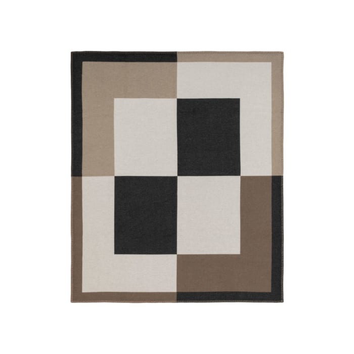
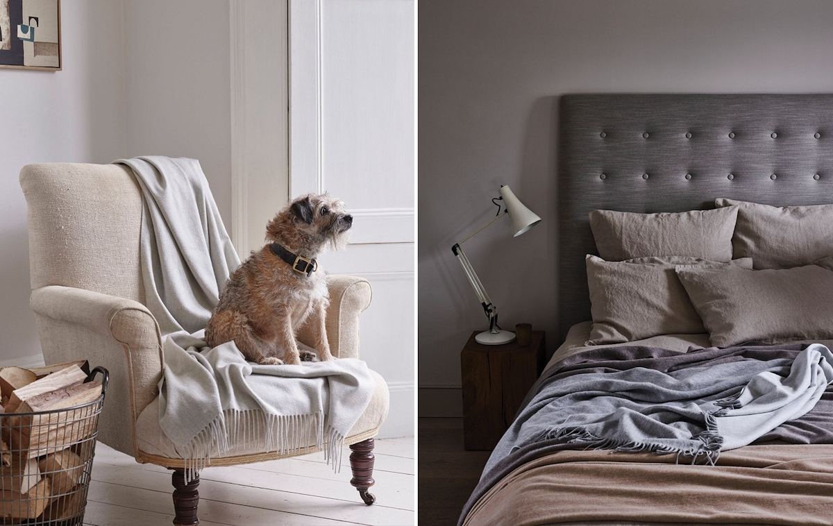
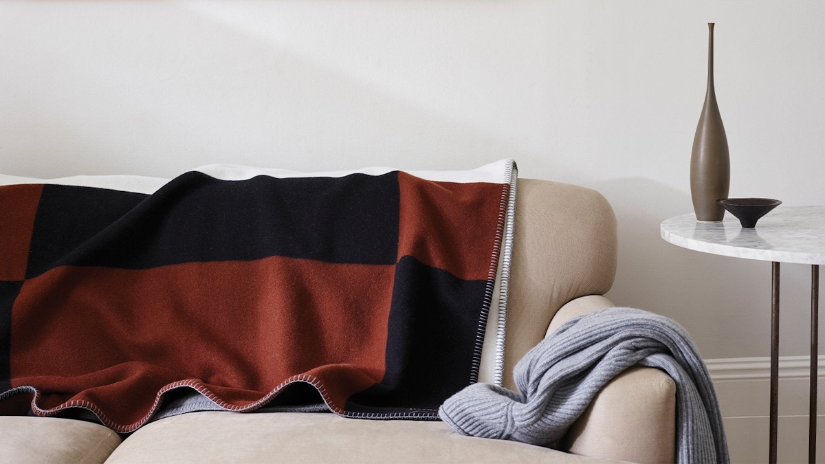
Think of cashmere and surely one of the first names to spring to mind is Begg x Co (or Begg & Co as they were formerly known), a British maker synonymous with prestige and unparalleled quality, in its materials as well as its meticulous making. Cashmere is its beating heart—though lambswool too isn’t left entirely out of the equation—be it in luxury cashmere blankets and cushions or, outside of the world of interiors, scarves and sublimely soft woollen hats.
Behind The Brand: Begg x Co
A British maker synonymous with prestige and unparalleled quality

A tale as old as time—the beginnings of Begg x Co
It is rare to find brands with a history which spans beyond the decades, but Begg x Co is one of the few that can say it first found its feet over a century ago, in 1866, with the same founding principles that drive the business to this day.
Craft and detail were to be found in the Scottish town of Paisley where founder Alex Begg decided to open his first mill, welcoming local weavers and appreciating them as the skilled artisans that they were. At first, the brand specialised in paisley-print shawls—in fact, its teardrop motif scarves are some of the earliest surviving creations of the iconic textile with one being preserved at the Paisley Museum. In 1902, Begg x Co relocated to the small coastal town of Ayr to allow them to expand, and it is where they have called home ever since.
Image Credit: Begg x Co
Working with the best quality yarns that Begg delighted in scouring for and sourcing from the very beginning, his products soon established themselves as the happiest of marriages between natural, supremely soft yarns and masterful artisanship.
Crafting with cashmere—Begg x Co’s principal yarn
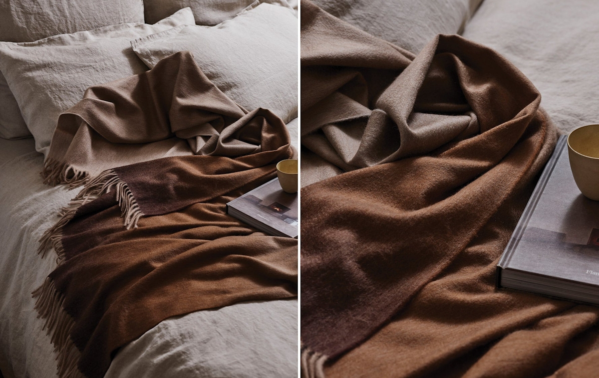
Luxury cashmere gifts are part and parcel of Begg x Co’s collection—a statement that has always been so. The desirable yarn’s character profile appealed to Alex Begg from the word go, not least because of its notoriously soft handle, but because of its ability to absorb dye like no other, ensuring the depth and complexity of tones that he planned to feature in Begg x Co’s pieces would shine through.
Image Credit: Begg x Co
With cashmere consciously sourced across Mongolia and its outer regions—home of the finest cashmere in the world—Begg x Co’s specialists combine various micron lengths of yarn to produce cashmere cloth that is the perfect balance of warm, silken soft yet lightweight. As members of the Sustainable Fibre Alliance, Begg x Co’s yarns are all sourced with sustainability front of mind, taking into account animal ethics and welfare standards for its farmers as well as environmental considerations, including the avoidance of harmful chemicals at every stage of the yarn’s journey.
But pure cashmere is not the only yarn story to be heard. Its weavers combine it with silk in some of its garments, but also step across to lambswool blends that are perhaps mixed with a rare classification of angora that’s even finer than cashmere.
In the making—a true tale of craftsmanship
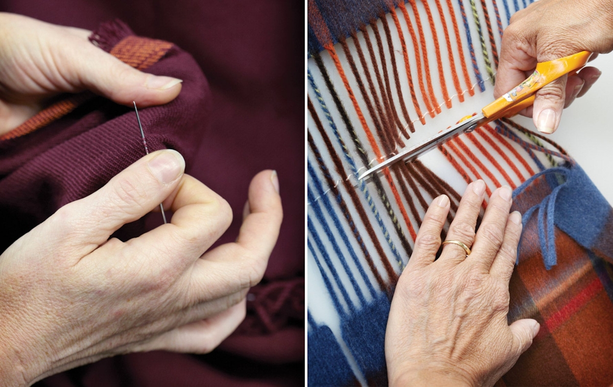
Modern machinery yes, but much of the Begg x Co way of working involves time-honoured techniques such as a wooden pummelling device built by Begg x Co seventy years ago to achieve greater softness still. Italian teasel plant heads continue to be used as a staple part of its craft process; these are what give rise to the slight rippled effect you see on many of its pieces. Equally, its products are pressed using copper-infused brown paper which results in not solely a smooth finish but a glossy sheen.
But machine and hand skills are only one aspect of the crafting cycle at the Begg x Co mill. Strict and careful measures to reduce waste, yarn-specific storage (such as the most premium 100% cashmere cloths are stored separately in a temperature-controlled section), rigorous QC and mending, and a final stop at the wash house to achieve the highest level of softness and purity are equally as important steps.
Image Credit: Begg x Co
A gentle difference—stepping away from Begg & Co
Followers of the brand and the eagle-eyed might notice that recently Begg & Co shifted to a moderately different brand name—Begg x Co—losing its ampersand and replacing it with an X to mark the spot.
The quiet rebrand to Begg x Co also sees a full review of its visual identity as its Creative Director Loraine Acornley explains: “The rebrand is to encapsulate the contemporary direction of the brand. Combining the industrial with the softer side of Scotland. We too have moved towards cleaner lines, cool greys and we removed the ampersand and replaced it with a more graphic mark in line with the new direction (a nod to the saltire on the Scottish flag). Our typeface is a Scottish-drawn typeface which we reworked, and the sustainability aspect of our packaging was also key. Swing tags, postcards, lookbooks, labels and packaging have all had the treatment.” Little surprise that any and all activity under the Begg x Co roof is thorough, consistent and deeply considered.
Brand values re-articulated—craftsmanship (beauty, thought and skill), passion (a balance of instinct and logic), authenticity (inspiration in its immediate culture and climate) and creativity (contemporary vision meets a spirit of curiosity); brand palette refreshed—the cool grey tones to reflect the Scottish landscapes that is peppered with grey from the sea to the sky and sodden pavements; and brand tagline decided—Made to last. Made with love. Made in Scotland. Let us simply say, Begg x Co, here’s to many centuries more.
