LuxDeco

A compendium for luxury living
Monochrome Interiors | Janine Stone | The Luxurist | LuxDeco.com

Colour Trend: Warm Monochrome

The popular colour palette returns with a warmed up aesthetic

Jade Bloomfield
By Jade Bloomfield, Editor
Image credit:

Colour trend alert: this is a black and white interior, but not as you know it. Dialled down and textured up, the new way to do monochrome is to tread softly, softly with shades of grey in place of black and everything from off-white to heritage cream rather than puritan white. Not to mention, texture in abundance so that you feel the colour trend as much as you see it.

Wondering how to achieve it within your own walls? LuxDeco’s Jade Bloomfield reveals all.

Black and white—the new hues

Monochrome is one of the most age-defying colour combinations out there. In fact, in its most classic sense (true black and true white), it is not really a trend at all; it’s anything but short-lived, a fad or an of-the-minute look having been loved and used in fashion, film and interiors for decades.

Warm monochrome on the other hand is a relative newcomer to the colour scheme game. Designers far and wide love it for its softness over monochrome’s typical starkness. The contrast is much lower meaning there’s none of the harshness of strict monochrome and the associated coolness—in terms of both colour temperature and character.

Monochrome Interiors | Banda Property | The Luxurist | LuxDeco.com
Image credit:

Instead of true black, expect slate and charcoal greys. Most designers deem anything paler than mid-grey to fall outside of the warm monochrome bracket and enters the realm of a pale, neutral scheme. On the light side, consider any warmer version of white to be fair game. Cream, off-white, stone, putty and taupe can all take white’s place and your room will feel all the gentler for it.

Remember too that warm monochrome is a sliding scale, so you can combine charcoal and a grey-tinted white, or keep one of the original components of monochrome, and mix it with a softer sibling to give rise to a black and cream living room interior, for example, or a charcoal and white bedroom.

Mastering texture: Part I—a question of tone

True of any colour topic in interior design, even the best colour palettes will fall flat without texture to provide lift, light, shade and visual comfort. With warm monochrome, texture first serves to provide depth to the scheme.

Take a black and cream living room (for example Janine Stone’s, pictured). The room explores black in different textural contexts from the grooved marble archway that leads into a marble-clad hallway, to the striated black contemporary rug that dominates most of the floorspace and the black-brown furniture in the far corner. Black even appears in the gilded frame oil painting on the wall, offering yet another perspective on this, the deepest and darkest of colourways, this time with sheen and reflection.

Monochrome Interiors | CJC Interior Design | The Luxurist | LuxDeco.com
Image credit:

A similar story is true of the cream aspects of the room. Off-white panelled walls are accented with white cushions on the curule stool, beige yarn in the rug, champagne orbs in the central chandelier and then golden tones of biscuit, bronze and gold that are all considered variations and interpretations of white according to the rules of warm monochrome.

Mastering texture: Part II—a case of contrast

With your whole room subscribing to the warm monochrome palette, you are able to strengthen your colour choices. Textured accents aren’t solely serving further iterations of black and white—instead they show how contrasting textures can bring a new dimension to each hue.

See the Cristina Jorge de Carvalho cream bedroom, where there’s a warm white hide draped at the foot of the bed. Compare that to the same shade of white seen in the soft-pile area rug. The same tone it may be, but the difference in texture presents it in two contrasting, yet complementary, lights. Similarly, the silk taupe lampshades are not dissimilar to the upholstered bed, nor to the two wicker stools, but, once again, the variance in material and texture presents the same shade differently. The results are a united scheme with myriad textures and a beautifully balanced aesthetic.

By exploring colour through texture—be it slubbed linen sofas, rough hewn wooden floorboards, bouclé wool cushion covers, suede photo frames, velvet pouffes or onyx granite objets—you open your eyes to warm monochrome’s hidden depths.

Accenting a monochrome palette with wood

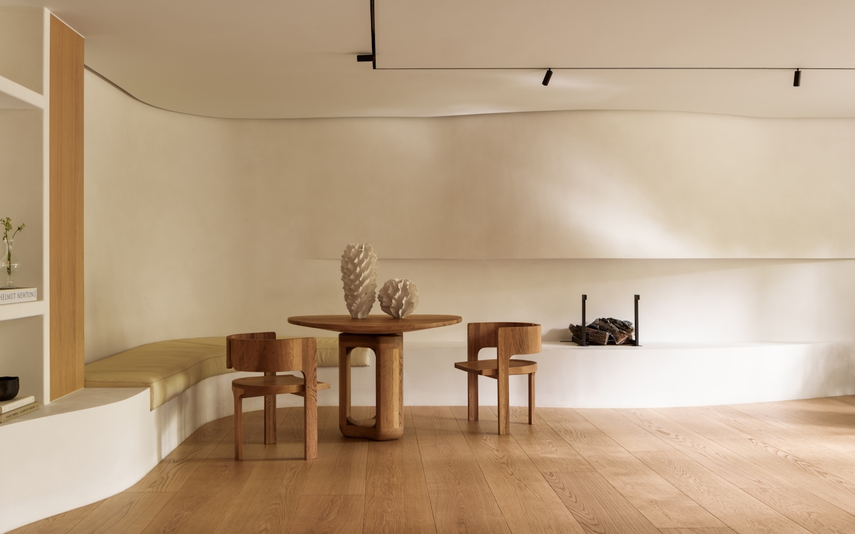
A final point to note with the warm monochrome interiors trend is how prolifically wood is used to temper the palette and add warmth.

Maybe you prefer the colour coupling of jet black and crisp white, but still seek to soften them somehow. Enter natural timber, which warms up the palette in the most effortless of ways.

Monochrome Interiors | Doherty Design | The Luxurist | LuxDeco.com
Image credit:

A hallway by Australian studio Doherty Design is a case in point. With Japanese screen-inspired panels that section the space and a smooth black handrail set against uninterrupted white wall space, this part of the home would be a perfect example of monochrome at play. Add smooth oak floorboards and beige linen curtains, however, and it’s a space transformed. Saved from a potentially crisp and cold vibe, this is an entryway that presents the power of timber’s tones and the potential comfort and familiarity waiting to be unleashed within the monochrome world.

If these spaces aren’t proof that it’s good to see things in black and white, then we don’t know what is.

;