What was the world expecting for Dulux’s Colour of the Year do you think? A bright tone? An uplifting tone? One that would revitalise walls and worried minds following the more than turbulent year we’ve unanimously endured? A hue to contrast with Dulux’s 2020 colour announcement, Tranquil Dawn—a shade that felt alive yet soothing akin to Pantone’s Classic Blue?

Dulux Colour of the Year 2021: Brave Ground
The colour expert’s thoughts turns to neutral rooms with a difference

But not so, for the experts at Dulux have put forward a colour that’s quiet, calm and unassuming to satisfy the neutral living room lovers of the world and to push the taupe bedroom fanbase out of their comfort zone a little.
We do a quick colour analysis on the newly announced ‘Brave Ground’—from the motives behind the hue to how to use it.
WHAT IS DULUX’S COLOUR OF THE YEAR FOR 2021?
Every year, the interiors industry awaits, with breath that is baited, to hear what the world’s two colour powerhouses will state as being their respective one and only for the year ahead. Pantone’s announcement comes later, typically in December time, whereas Dulux steps forward first to proclaim the single shade that it feels encapsulates and empathises with the mood of many.
For 2021, instead of selecting a colour that’s cheerful and positive (as so many assumed it would to rouse one and all and to act as a beacon, a sign that better times are to come), Dulux has kept things hushed and very much neutral. Reassuring, says Dulux; melancholic and brown, say the critics.
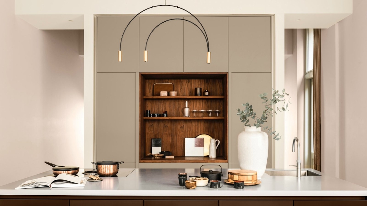
Brave Ground is a warm neutral. It’s a variation of brown, with grey in its undertones but also a hint of red, which is what helps it to toe the line between a modern shade and a more traditional one so that it may be at ease in a plethora of home contexts.
Reassuring, balancing and bolstering is what Dulux promises Brave Ground will offer a room, as well as a sense of tranquility amidst turbulence and versatility amongst other shades, creating a palette that is about ease and elegance.
HOW IS DULUX COLOUR OF THE YEAR DECIDED?
Designers, writers and thinkers, artists, analysts and architects all contribute to the melting pot that Dulux stirs each year in order to cook up what it deems as its definite, single-most important colour for the next twelve months.
This year, trend forecasters and colour specialists from the world over, gathered at the AkzoNobel Global Aesthetic Centre to reach its colour conclusion, a.k.a. Brave Ground.
“As a result of the global pandemic, many people's priorities are shifting significantly to focus much more on their well-being," explained creative director of Dulux UK Marianne Shillingford to Dezeen magazine."This is the mother earth of colours. It's organic, familiar and versatile. It's also trustworthy and supportive of all the other colours in the spectrum.”
Heleen van Gen, head of AkzoNobel's Global Aesthetic Centre in the Netherlands adds: “The past year has seen how we live and work utterly transformed. We have gone through the most uncertain of times, so it's understandable that we see reassuring, natural tones returning, which can be used to create the calm and sanctuary people require.”
And the question of course on everybody’s lips, was the colour informed by the pandemic? To which the answer is a firm no. The colour was chosen pre-COVID-19 and did not alter its course in light of it, surprisingly. "Despite COVID-19, the course of our future is still the same,” Marianne continued. “The mood of the moment is to have courage—the courage to change.”
HOW TO USE BRAVE GROUND IN YOUR HOME
Whether you’re a neutral lover or not, there’s an indisputable ease to Brave Ground, suiting absolutely any room in the home. It blends beautifully in spaces that see high traffic and high energy—a neutral kitchen is one way to slightly slow the pace, to calm the chaos and to help it channel a living space ambience rather than being all go twenty-four hours a day, seven days a week.
In terms of what to blend it with, however, consider taupe kitchen cabinets against sandy, ochre walls surrounding the dining section of the room. The richness in colour denotes a different zone, one that is immediately warm and welcoming to encourage people to gather together and break bread.
A neutral bedroom idea offered up by Dulux is to unleash Brave Ground’s energetic side by teaming it with punchy pinks and dynamic reds. They call this their ‘Expressive’ palette and it’s made up of colours such as Berry Pop, Lost Coral and Terracotta Army. Put against these hues, Brave Ground’s putty brown character comes to the fore to create a dimensional neutral bedroom that is rich and earthy but equally spicy and playful.
Another part of the home especially suiting Brave Ground is the home office. It’s a steady colour that promotes calmness of mind and clarity of thought when it’s mixed in with other neutrals as well as wooden and metallic tones of oak, aged brass and matte black steel.
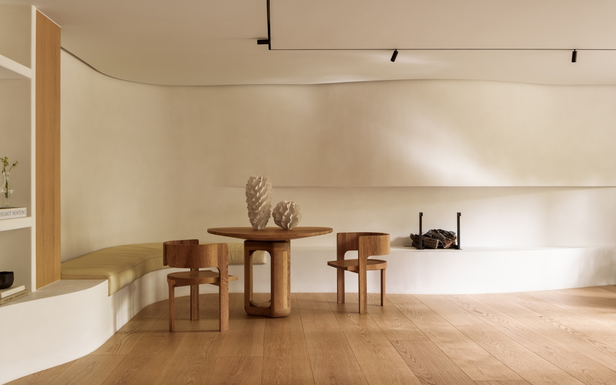
And finally to the not-quite-mushroom, not-quite-taupe living room, where once again, Dulux is showing how neutral living room ideas can be anything but neutral.
“When using this paint colour on walls in the home, we'll find at night it's quite dark and powdery, but in the morning we see hints of pink coming through,” said Marianne of Brave Ground’s hidden depths. Meaning, even if you were to use Brave Ground on its lonesome in a living room, it would feel anything but one-dimensional.
Otherwise, Dulux suggests a partnership with a deep sea blue is a match made in heaven where the waters will feel serene and set for smooth sailing—something we all could do with in the here and now.


