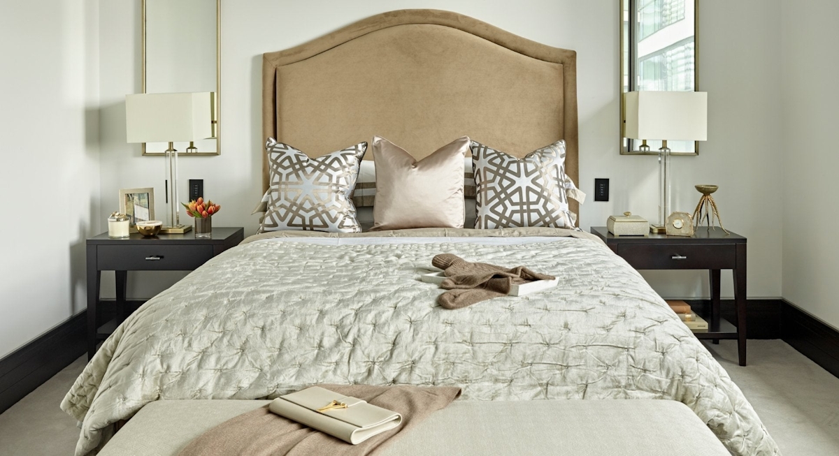
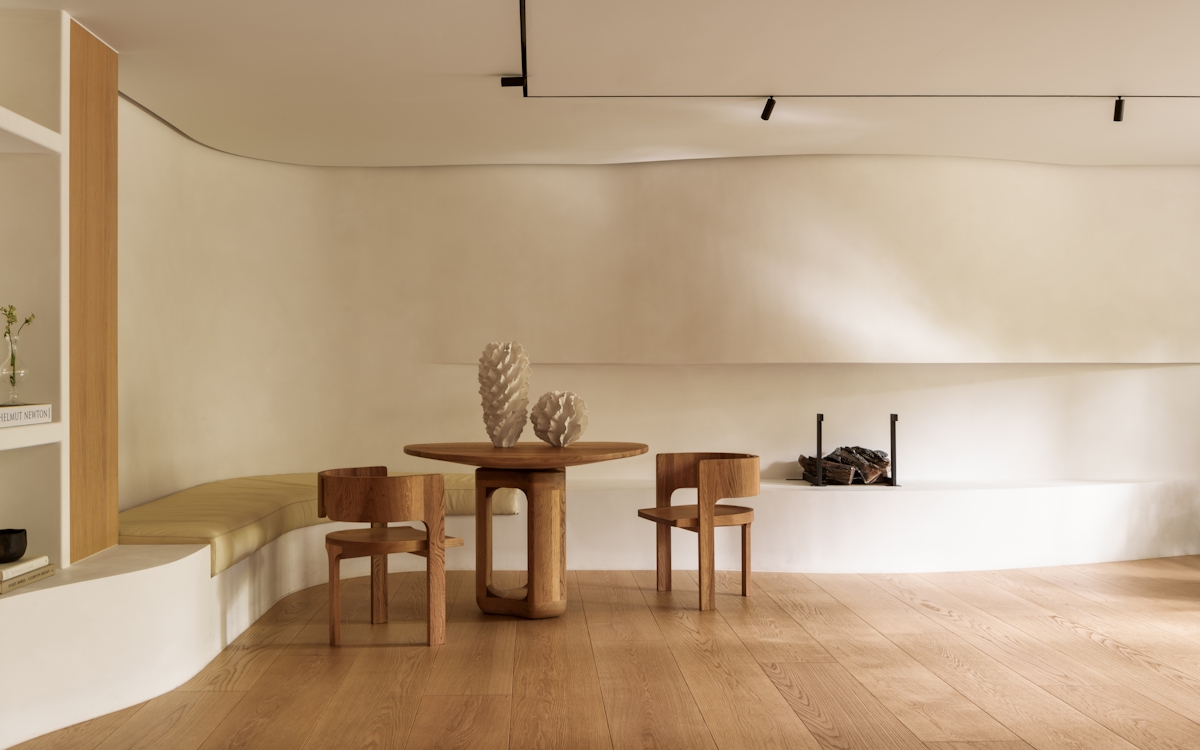
The LuxDeco interior design team aren’t solely enlisted to transform properties for its beloved owners (like the recent Alexander Square project), but also for their home staging expertise in making rentals all the more appealing to potential tenants. One of their home staging projects from last year in London is proof of that. Read on to discover which prestigious, high-end development it was that they styled and exactly how our Interiors Director, Linda Holmes and her team were able to turn an empty new build apartment into a rental home to swoon over.

Home Staging a Rental Property: A LuxDeco Interior Design Project
Discover more about our home staging project for a luxury rental property

Project Summary
– Project Name: One Tower Bridge
– Location: Crown Square, London
– Floor area: 2593 sq ft
– Time to Complete Project: Three months
– Budget: £100,000
Property Overview
“Our client’s three-bedroom apartment is part of an incredibly prestigious development called One Tower Bridge. Its luxury corresponds to the splendid amount of space, the uncompromisingly high quality of its finishes (something which its developer, The Berkeley Group, is recognised for within the property world) and indeed, its location with immediate views of The River Thames, Tower Bridge and the Tower of London – three of the capital’s greatest and most iconic landmarks. Unsurprisingly, the price tag attached to it is high. With multiple bedrooms, a separate study, luxury bathrooms and a sizeable balcony, it’s valued at £9,500,000.”
The Client Brief
“The difference with creating a design scheme for a rental property as opposed to a client’s own home is that the whole process tends to move much faster and the brief is more business-minded than emotional. It becomes less about what our client sets their heart on and more about what is practical and essential in order to sell the space. It needs to be unbiased, to have broad appeal. This is where we guide on how to stage a house, from colour palettes to furniture and accessory choices. Our client did have one request however – a bolder blue palette in the living room to blend with the surrounding views of the River Thames and the sky blue accents on Tower Bridge itself.”
The Process
“Our client purchased the apartment with the sole intention to release it onto the rental market. Living overseas meant that much of our design conversations were predominantly done over the phone or email. While we went to and from the property to take measurements and get a feel for the natural light and temperature of each room, we met with our client only once. This was to deliver our first presentation and invite feedback on what they wanted to be edit or develop further. From here, our amends moved quickly and the client was happy to not meet a second time, signing everything off within just two weeks.”
Our Client’s Thoughts
“Once the project was complete, our client contacted us to express their views on the finished results. Their words were as follows: Thank you for this project. Everything turned out as I wanted – very elegant, discreet and stylish. It was very easy and pleasant for me to work with you and your company. Of course, I will gladly turn to LuxDeco again.”
Linda’s Top Home Staging Tips
“Whenever my team and I are designing a rental property, we will always advise our client on the following principles of appealing, welcoming design. Firstly, favour a predominately neutral palette with warm, tonal accents that will make the space feel inviting and luxurious while avoiding being style-specific. It is also important to not be tempted to overfill the property with furniture. We aim to create a canvas that leaves room for the future residents to express themselves by adding their own pieces."
"Accessories are often overlooked, perceived as being superfluous in a rental, but these are what will help potential renters or buyers to envision living in the property. Seemingly simple touches such as books and cushions create a ‘homey’ look rather than a soulless one. Just be careful not to overdo it and cause clutter which spoils the feeling of calm and space. The classic suggestion of filling vases with fresh flowers is very valid indeed as they give such lift to any room. If you fear needing to refresh them constantly, choose a realistic faux variety of flowers or foliage instead – avoiding glass as the vessel material makes it even harder to notice they aren’t the real thing as you can’t see the lack of water. And finally, it is certainly worth dressing a bedroom, or all of them if possible. Mattresses and bed frames are not stimulating to look at and have no effect in encouraging viewers to picture themselves living here. An empty bedroom feels bleak, but a dressed one is beautiful and beckoning.”


