LuxDeco

A compendium for luxury living
Common Interior Design Mistakes & How To Avoid Them

Common Interior Design Mistakes & How To Avoid Them

Six of our Tastemakers on their biggest design peeves and how to avoid them

Joanne Quinn - Senior Interior Designer at LuxDeco Studio
By Joanne Quinn, Senior Interior Designer

Albert Einstein once said, “anyone who has never made a mistake has never tried anything new” which is a nice sentiment until you have to live with it. It’s true – some mistakes do need to be rectified and fast! Whether it’s a style habit learned from a parent or a design element that never quite loaned itself well to your room, sometimes it’s easy to fall into the trap of common design mistakes. These design crimes can shortchange your space and leave it falling short of its true potential so it’s important not to let them go undetected.

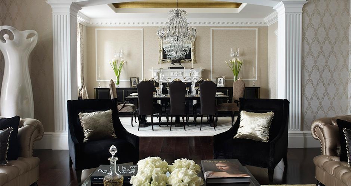
We spoke to six of our interior designer Tastemakers to discuss their biggest design peeves and how to avoid them. From unsympathetic restorations (unlike this striking Georgian townhouse redesign by Oliver Burns, above) to visible clutter, we tackle the biggest offences.
Katharine Pooley

“People sometimes forget to think of their home as a whole. It is important to consider how the space will be used and the overall flow of the design from room to room rather than thinking of each room as a separate entity. Homes that are designed without a common thread can feel disjointed or chaotic, the best way to tie a scheme together is to identify a versatile colour palette that resonates with you and can be interwoven in different tones throughout your home.”

Jean-Louis Deniot

“A décor scheme is like a painting. It’s all about the masses, colour placement, volumes, proportion and contrast in order to achieve the right balance. Without a considered approach to the layering of elements, a space can seem unbalanced – either too overbearing or too bland.If an element has a subdued aesthetic, you play with a strong piece of furniture or a stronger pattern. When it’s a strong element, then you accentuate with lower-key accessories.”

Sophie Paterson

“One of my pet peeves in interior design is clutter on show. Whenever I use open shelving in my designs I always make sure I source beautiful objects and style the shelves for my clients so that they look beautiful. I also ensure that I provide plenty of storage so that my clients don’t need to use the open shelves to store unsightly objects.”

Joe Burns

“Period properties that aren’t restored sympathetically – period features add character and value to property so when these have been removed altogether or replaced with inappropriate alternatives, this affects the overall design and can devalue a property. We always try to make the most of the character of the properties we work on and if period features have been removed, we often re-instate them.”

Sara Cosgrove

“I really struggle with low ceilings. Space is central to a designer and when you have limited ceiling height, no matter how big the room, it limits the spatial options. In saying this, if you have a dropped ceiling you can find some solutions! Depending on the wriggle room, you can strip back to the ceiling slab and create a coffer that includes perimeter lighting and uplighting in the coffer – then wallpapering the coffer in a metallic material. These tricks can maximise the limited height of the room.”

Jeff Andrews

“One of my pet peeves is when curtains are hung either too high or too low. Too high and they look cheap and silly, too low and they just look sloppy. In my opinion, the drapes should just barely kiss the floor or have a slight break in the fabric.”

;