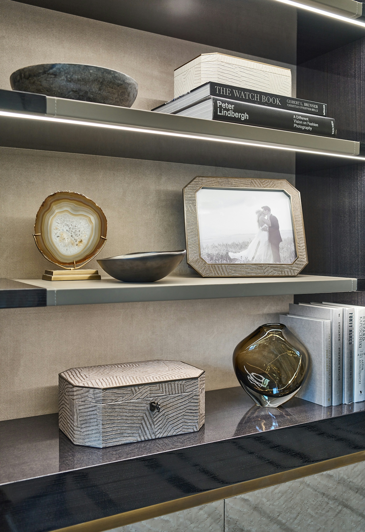
Award-winning interior designer Laura Hammett reveals her steps for styling eye-catching shelves and takes us through some of her favourite pieces in her exclusive LuxDeco collection.

How To Style Shelves with Laura Hammett
Explore Laura's shelf styling tips and the pieces you need to get the look

1. Opt for scale
"Try to avoid too many small items, instead go for the biggest items that you can fit on the shelf. A great base to start with is a big stack of books, the coffee table books on this side work perfectly and then I’d advise putting a smaller box or object on top."
2. Design each shelf in relation to the others
"Another rule I'd always look at is making sure all the shelves relate to each other nicely so you don’t have a top shelf that’s too heavy, anything large I would put on the top shelf. But equally, you want each shelf to feel very nicely balanced so you haven’t got lots of areas that are very empty with too many small items and other areas that are very crowded."
3. Cluster items and avoid clutter
"You want to divide the shelves up into sections so that you’re working with little clusters. For a shelf this width, I would do two clusters. When you’re looking at decorative items to add in detail, agate for instance is a really great one, never leave a piece on its own so cluster it with another item, so that you've got a cluster of two or three."
4. Add some personal touches
"If you don’t have a dressing table large enough to fit the jewellery box, I’ve actually taken the insert out of this one so that you can use it as a nice storage box and then the insert can be slipped into a dressing table drawer so you can use the storage in there. I really like working with larger picture frames, so the two in the collection are quite large. This one on its own works really well because it fills a lot of volume. It’s also nice to pair that with something else and I like using these two colourways together, I think it just adds a bit of dimension."
5. Stand back and review
"When you’ve finished you need to stand back and look at the whole display together and make sure to look at it from a few different angles to make sure you’ve really hit those three main points. You’re looking for balance, proportion and clustering so that nothing is looking like it’s left on its own."

