A glimpse inside Cuban-American designer Natalia Miyar’s Portfolio and you will find an array of projects all bursting with colour and an artful combination of pattern. Miyar has mastered this look like no-other, knowing exactly what works and which unexpected materials make for the most marvellous interiors and her Ibiza villa project is no exception though this time she has chosen to embrace, perfectly execute, a mid-century style.

Inside Natalia Miyar's Mid-century Modern Ibiza Villa
Bold, playful and bursting with colour, step inside this inspiring project.

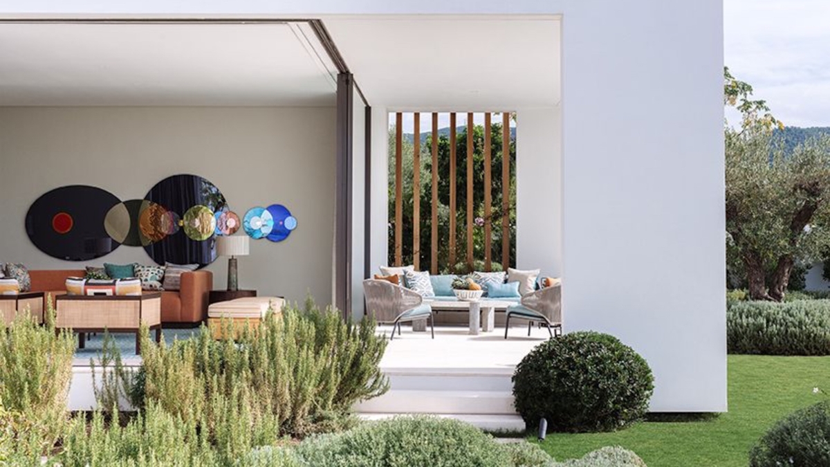
What was this inspired by? “On my first visit to this ibiza house,” Miyar explains, “my clients showed me this incredible work by Studio Olafur Eliasson that they had bought before we had even discussed the interiors of the villa. It was meant to be the focal point of the sitting room.” The artwork in question, a series of brightly coloured glass circles that align in a way that is reminiscent of the solar system, brought a playful energy to the villa and sparked Miyar’s imagination, “I love using a work of art as the foundation of a room.”
Here we explore how she incorporated key Mid-century Modern elements.
A Mid-century colour scheme
Opening out onto the infinity pool outside, the villa possesses a combination of vast open plan spaces and smaller, more intimate rooms: the perfect place for a designer to truly play. And play she did. In true Natalia-style each surface displays a different texture reflective of the natural elements that lie beyond the glass walls, and each room introduces a new colour scheme: ochre, dusty orange, cerulean and rich copper can all be found beyond the rustic doors.
Mid-century art
“My favourite part of working with clients is creating an interior that is unique to them,” reveals Miyar. Inspired by the artwork that sits above the sofa, the rest of the scheme came together with a colourful take on mid-century design. “This Studio Olafur Eliasson piece is really exciting because even though some of the mirror is coloured, it also takes on the colours of what it reflects, so I incorporated some of these bright tones into the sofa, rug and cushions. It really was a case of starting with the art.”
A Mid-century Modern feel to the dining room
For the dining space, rather than incorporating colour through the upholstery, Miyar chose a dining table that reflected the yellow of the artwork. “I love the unexpected pop of colour in the lacquered ochre base on this dining table. We had this custom made for our client. It really sings when offset against the chairs and it picks up the colour from the art piece.”


