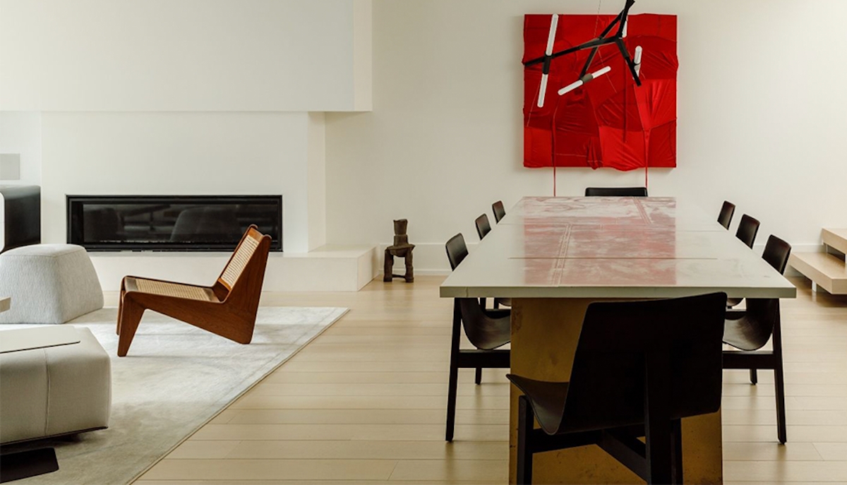
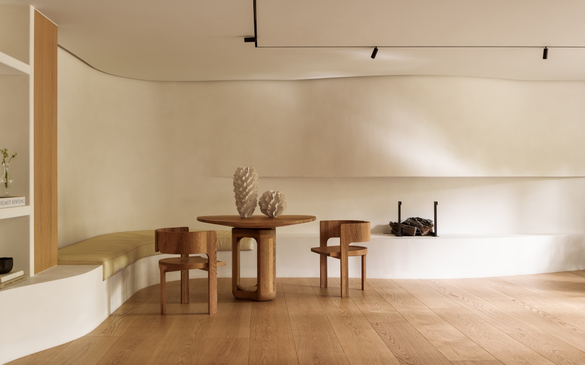
Like most styles, design approaches to minimalism don’t take on a singular interpretation. Minimalist interiors range from the ultra-orthodox—white boxes with a high ratio of space to substance—to just a subtle acknowledgment—tailored white upholstery, a neutral palette and restrained styling. And, for certain designers, a new approach has been forged: bold minimalism.

Going Bold With Minimalism
A step away from the purist approach, Humbert & Poyet prove that minimalism also belongs to the bold.

Oxymoronic in some ways: in others, a testament to the versatility of this never-out-of-fashion look. Awash with texture, subversive scale and a playful take on furniture, this particular aesthetic is the meeting of two seemingly paradoxical styles.
In bold minimalism, it’s less about finding the perfect right angles and never painting walls so much as a fraction darker than pure white. It requires going back to design basics—form, line, space, texture, emphasis, balance, variety—carefully choosing one (maybe two) and exploring the possibilities with restraint, all the while rooting choices in that favoured of all minimalist devices: the colour-free space.
Texture and form, for example, make a perfect pairing in bold minimalism. Together, they’re enough to justify a piece that plays on the outskirts of the traditional understanding of the look which works well for those who don’t want to commit to the more spartan version of the look. As long as colour palettes are pared back, there’s no reason that a coffee table crafted from high-texture charred timber (also known as yakisugi) can’t curve, twist or boast an eye-catching form. Or, for an equally successful bold minimalism combination, emphasis and scale. A singular art canvas, oversized in its scale, even if colourful, adds confidence to a space. When placed against a crisp white wall, with nothing else to detract, the effect is that of bold minimalism.
Nothing quite epitomises this approach like this vignette in LuxDeco 100 designers Humbert & Poyet’s Louvre project—a space muted in colour but one that exudes energy with a concoction of textures, minimalist art and playful, black and white patterns. Monochromatic trompe l'oeil covers the floor whilst acrylic-encased, paper-white artwork bring dimension to the walls. Here, a pillar-like structure dominates the vertical space—a piece, though an unexpected addition, that epitomises simplicity in its finish and hue. Out of shot, black marble envelopes the door frame, a stark contrast to the white panelled walls.
To balance the unexpected forms of the furniture, duo Christophe and Emil stick to a palette of cool neutrals to maintain a semblance of restraint. Through the use of natural materials, the likes of marble, plaster and wood, there is a feeling of subtlety without the need to compromise on texture and touch—something that both designers believe essential to each of the projects in their portfolio. It is in these details that we learn that the refinement of minimalism need not be in the beauty of nothingness but in the beauty of the deliberate and the flawless.
Recreate the look with curated sculptural artwork, dynamic texture combinations and an attitude that a style shouldn’t constrain you, but should inspire.

